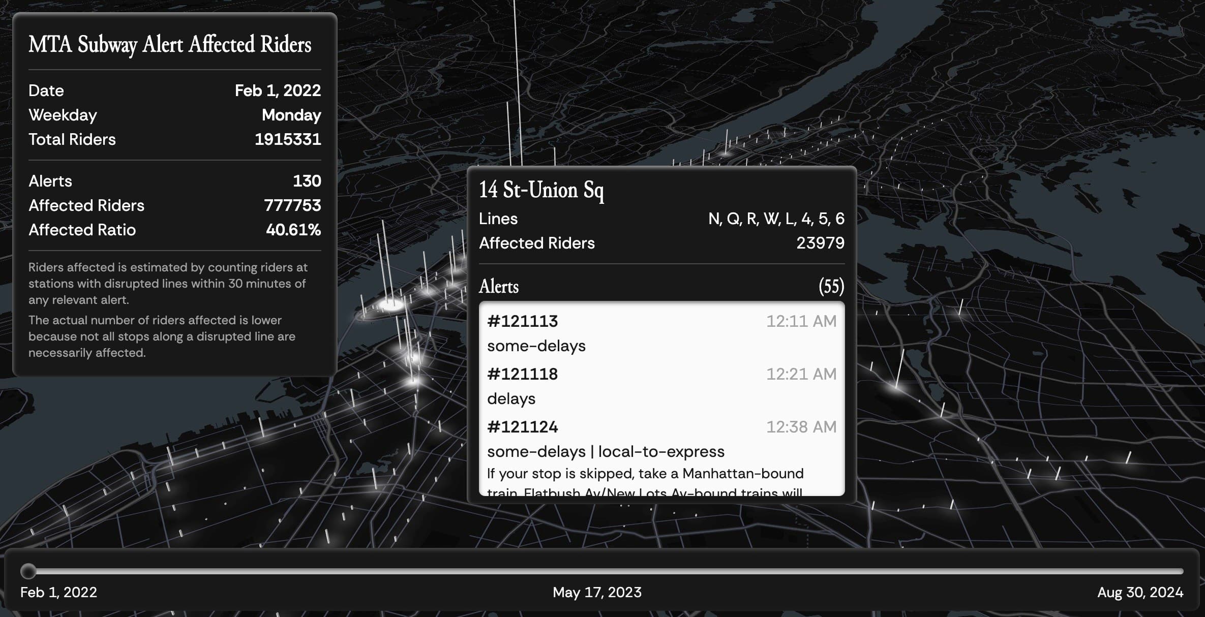
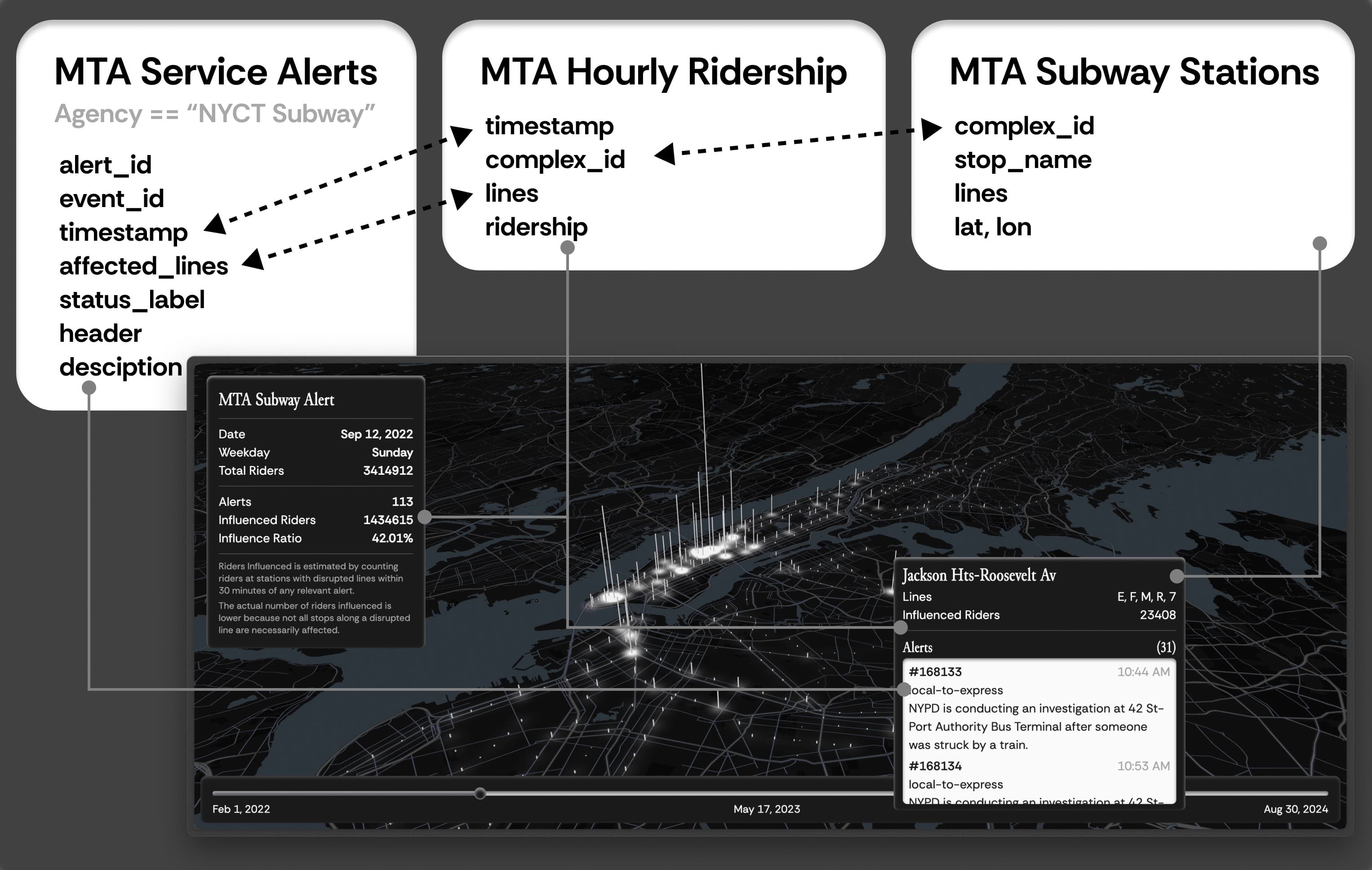
MTA Subway Alert Affected Riders is an interactive visualization platform that explores the relationship between MTA subway service disruptions and ridership patterns from February 2022 through August 2024. The platform maps potentially affected ridership by correlating service alerts with station entry data, providing insights into the spatial and temporal impact of service disruptions across the subway system.

Key Features
Dynamic Heatmap Visualization
Shows the distribution of potentially affected riders across the subway system
Station-Level Grid Analysis
Provides detailed visualization of impact at individual stations
Interactive Tooltip
Displays relevant service alerts throughout the day for each station on hover
Historical Analysis
Allows users to explore any date within the 31-month period
Important Disclaimer: My estimation provides an upper bound of affected riders. The actual number of riders affected is likely significantly lower because:
- Not all stops along a disrupted line are necessarily affected by the reported incident
- Some riders may have alternative routes available
- The alert may affect only a specific segment of the line
- Some riders may have been informed of the disruption before entering the station
Key Insights
The analysis reveals several interesting patterns:
- The percentage and absolute number of potentially affected riders show an upward trend from 2022 to 2024
- This trend should be interpreted cautiously, as overall ridership has also increased during this period
- While the correlation between affected ridership and alerts isn't definitively robust, the visualization provides a tangible way to understand the scale and spatial distribution of service disruptions
- The platform enables stakeholders to identify patterns in both the timing and location of service impacts
Datasets

This repository contains code to process New York MTA (Metropolitan Transportation Authority) data from three main datasets:
- MTA Subway Stations - Station locations and route information
- MTA Service Alerts - Real-time service alerts and disruptions (2020-04-28 to 2024-08-30 when accessed)
- MTA Subway Hourly Ridership - Hourly ridership data by station (2022-02-01 to 2024-10-01 when accessed)
Note: This project analyzes the overlapping period between the alerts and ridership datasets (2022-02-01 to 2024-08-30).
Timelapse Visualization
The timelapse visualization provides a dynamic view of how service disruptions and their potential impact on ridership evolved over the 31-month period. The animation shows:
- Daily patterns of service disruptions across the subway system
- Temporal shifts in affected ridership concentrations
- Seasonal and yearly trends in service alert distributions
- Geographic hotspots of recurring service impacts
This bird's-eye view of the data helps identify long-term patterns that might not be apparent when examining individual days, making it a valuable tool for understanding systemic issues and recurring problem areas in the subway network.
Reproduce the Project
If you want to reproduce the data processing, you can go through the instruction in the README on GitHub.

